Careful: the glass is always cleaner on the other side of the fence. ![]()
Personally I found switching the safari setting from compact design to bottom make my experience more easy again as infer some of the buttons back that I got so used to ![]()
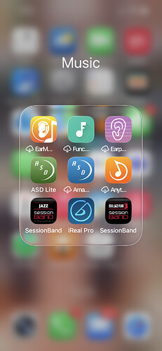
I finally found something I really like! When clicking on a folder in the homescreen, the folder contents ‘hover’. My brain really likes the contast between the in focus contents and the out of focus background, and the sense of a flat, transparent plate of glass.
I finally understand the design metaphor for the first time here, in a way I really don’t elsewhere, for example with the control panel.
Nice tip, just changed the setting.
thanks !
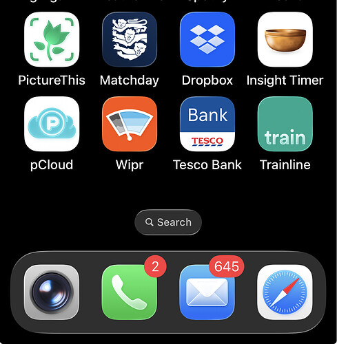
But here it makes no sense as I don’t see why the commonly used apps are ‘floating’ higher than the other apps
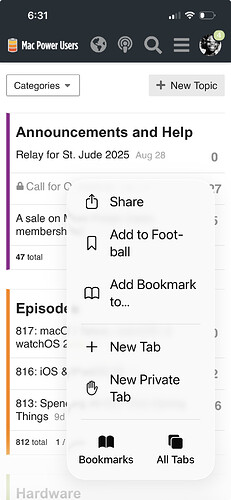
And on Safari bookmarks I really don’t get a sense of the floating glass. Conclusion - it is badly implemented and I really need to re listen to ATP when they discussed it ![]()
Personally, I believe OS 26 still a beta, and an early beta at that. I’ve been using iPads since 2010, and as my primary computer for the past seven years. Now I’m using my macOS 15 MacBook for most things.
I wrote this post on my iPad Air but had to click Reply on my Mac to post it. Then I got a “new iPad” notice. ![]()
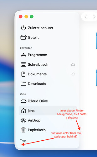
One irritating design decision that doesn’t makes sense to me „realistically“ is the sidebar in apps like the finder, notes and others. A bit hard to describe and capture in a screenshot (I tried ![]() )
)
but the way it seems to be designed now is that the sidebar gives the illusion of a transparent sheet of glass floating above the background of the window - hence the shadows being cast on the right side of the panel and the white „border“ which appears to come from the background of the application.
As glass layer on white background doesn’t make for a fancy look the glass sheet now takes on hues of the color of the wallpaper, which totally breaks my understanding of the little physics I know. I cannot imagine how this would be possible with real glass??
If I consider Apple trying some kind of skeuomorphism to „prepare“ us for a real glass iPhone, then I feel they got realism wrong in this case ![]() . I don’t know - nothing important but something that keeps me mystified everyone I see it
. I don’t know - nothing important but something that keeps me mystified everyone I see it ![]() .
.
Hope I was somewhat able to convey what I was trying to say
[JensV]
One irritating design decision that doesn’t makes sense to me „realistically“ is the sidebar in apps >like the finder, notes and others. A bit hard to describe and capture in a screenshot (I tried >:innocent:)
That does make sense, and is a good example of what I am thinking about
Wayne G
Personally, I believe OS 26 still a beta
It would be good to think it will refine itself nicely.
Interestingly, I find MAcOS 26 Tahoe perfectly inoffensive. Not that interesting or enjoyable, but not jarring.
Thanks for that, Robert! Made my week.
Did Apple change those ugly edges around app folders on the Home Screen in iOS 26.1?
Since installing the RC of 26.1 folders look even worse to me; they now often look like parallelograms instead of squares… (probably an optical illusion, but it looks so weird/bad)
(OTOH, I have to admit that -after changing my wallpaper- opened app folders look pretty nice on iOS 26, so that aspect of Liquid Glass has grown on me)
They really do look good
To be fair, at that point (pre annual major OS updates) they only had one OS and obviously then no interconnected fleet of hardware.
This meant that OS X was released when it was ready.
I don’t see how they do that now
Change it back to the old view in settings
Just to say that I happen to be a fan of many things in Liquid Glass. I prefer it over the previous iOS. I like the very thin outlines around the buttons, and their actions when pushed. I enjoy the overall look.
MacRumors sharing What to Expect From iOS 26.4.
The lacklustre adoption of iOS26 isn’t from features but function and usability. I see nothing here which fixes any of this.
Last weekend I finally gave up, wiped my Macbook Pro and made a clean install of macOS Sequoia; the UI just feels so much calmer and cleaner to me than Tahoe - I never managed to get used to it and I felt I was constantly fighting the UI and at some point I realized I even became hesitant to sit at my Mac ![]() . But now I’am happy again.
. But now I’am happy again.
Since yesterday I have reverted 8 other Macs from family and co-workers (thanks to fast SSD install drive and internet connections ![]() ) who all got encouraged by my relatively easy success as the were all begrudgingly using their Macs with Tahoe with its “Candy UI” as one colleague said. In our family we store everything in iCloud and so after the install it only took roughly two hours to sync everything back done again and I am up and running again (besides all the little tools and settings, but it feels so good to start afresh
) who all got encouraged by my relatively easy success as the were all begrudgingly using their Macs with Tahoe with its “Candy UI” as one colleague said. In our family we store everything in iCloud and so after the install it only took roughly two hours to sync everything back done again and I am up and running again (besides all the little tools and settings, but it feels so good to start afresh ![]() .
.
So that probably was macOS 26 for me … lets see what macOS 27 brings to the table next January ![]() .
.
Not gonna lie… the thought has crossed my mind. In the end, I don’t want to risk some app having a conflict, and so I will just tough it out. But every time I sit in front of my Mac, “a little part of me dies inside,” as the saying goes. Sad😔
