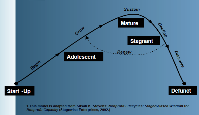
I want to create something similar to this using my own research-based categories. What app/program would you recommend for this? The simpler the better as I don’t want to spend a lot of time in design, a skill that I have limited experience with, though I hope someday to learn
I have Affinity Designer but I have not yet taken the time to learn how to use the app, I bought it on sale for future use. Maybe it is time to learn, the “future is now?”
Anything that can draw arrows and boxes can do that. Even Keynote!
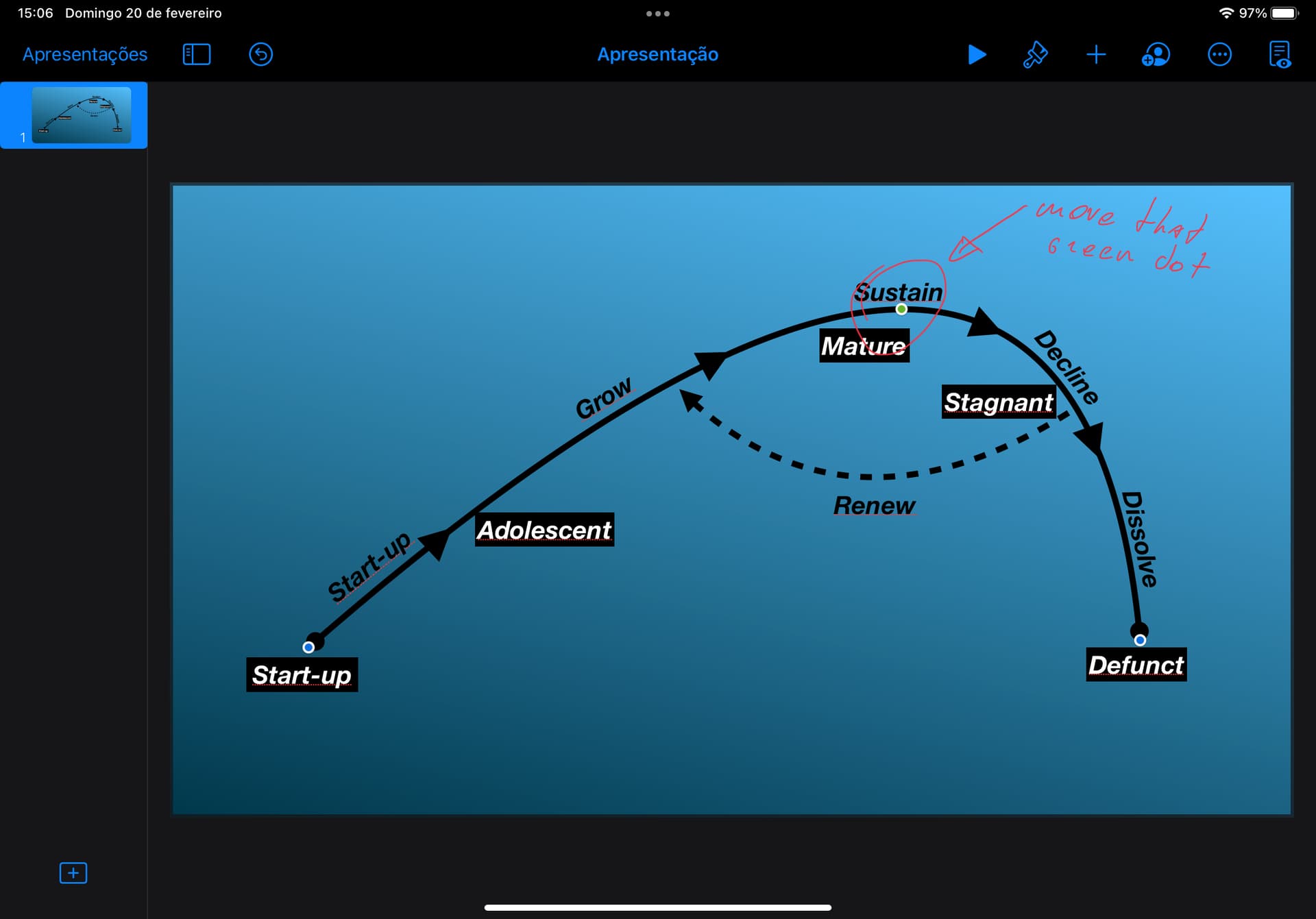
Edit for proof of concept, done in less than 10 min on iPad (I guess it would be even faster to do on a Mac, since the inspector sometimes makes it hard to see the object when editing its properties, but it was a fun exercise nonetheless):
Very cool, Did you use Keynote? I just tried Keynote and came up with this, not bad for my first ever attempt. Your’s has a smoother curve, how did you do that?
For exports, if I need quality and fidelity (specially needed when gradients are involved), I’ll go PNG. If I don’t, JPG will make for smaller files (even on its higher quality output).
Thanks, you have been a tremendous help. Keynote is much easier than Affinity Designer, though I still want to learn how to use it. Thanks again!!
PS, I sent the original image to Apple Notes and used Live Text to extract the text so I could copy and paste it into my version of the image–pretty cool tech.
The omnigroup used to have a app called omnigraphsketcher. I used to use it quite a lot for charts just like this. However they open sourced it a few years ago. It can now be found here https://github.com/graphsketcher/GraphSketcher/releases
I have no idea if it still works - but it would have been easy (IIRC) to make a graph like this
Will throw Figma into the ring as well. I usually Affinity Designer but Figma is good for collaboration, keeping diagrams alongside mockups, and for when I’m on my PC and too lazy to download AD for a simple diagram.
Another thing to consider is the minimum resolution (usually stated in dots per inch, DPI) your publisher and/or printer expects.
It’s a simple matter to open an image in Preview, use Tools | Adjust Size and change the resolution to, say, 600 DPI (pixels/inch).
So it’s simple now, but going back and changing all your figures would be a pain.
(You could use ImageMagick, but there’s installation, learning curve, command line, etc.)
It’s funny how excellent Keynote is for this sort of design stuff, when it is ostensibly a presentation app. There are so many dedicated apps that may be more powerful, yet I find myself reaching for Keynote for its speed, ease of use, reduced friction when it comes to things like arrange, align, groups, instant alpha, advanced handing of shapes, etc.
I would suggest that for most cases we have enough bandwidth and Storage capacity in society that if you are creating an image yourself from scratch PNG is almost always the answer over JPEG. Let’s leave JPEG for when a camera is taking a photo of a bunch of trees and houses. The file size difference is pretty insignificant for anything that you can create from scratch with image editing/creation software. /end opinionated opinion
 Maybe it is time to learn, the “future is now?”

 Your’s has a smoother curve, how did you do that?