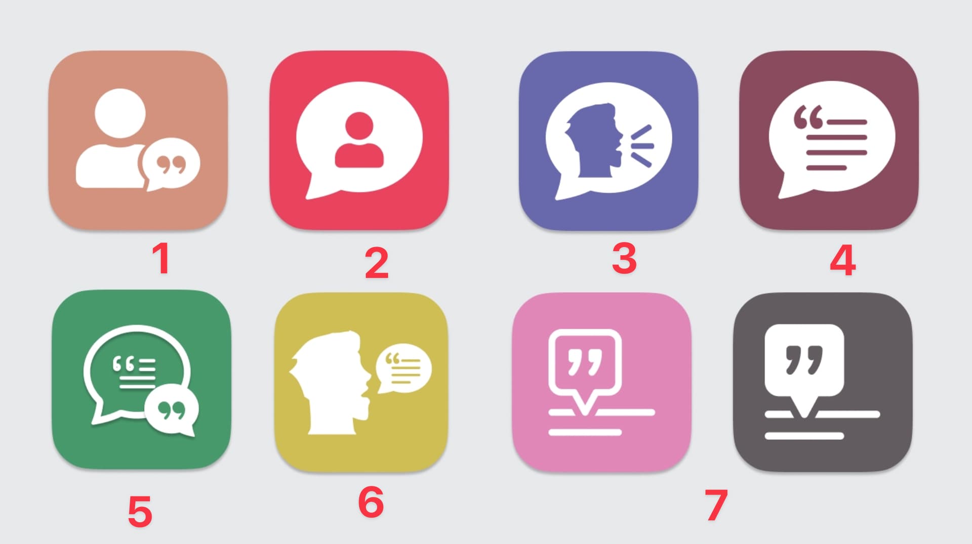
#9 is my favorite, followed close by #2.
I prefer 3 and in my view I wouldn’t worry about the colours looking like some other app. There are only so many colours in existence and not that many combinations. You have no idea what apps people will have on their phones, so don’t go out of your way worrying about it.
I chose 3 because it’s bright and playful; quite the opposite of 4 or 5, for example.
Thanks everyone!
I already had my colors picked out. (@JohnAtl was on it!) This round I was really just looking for which shames & designs moved the needle for people. I got some great feedback to work with and I’ll post the results from the next round of revisions soon.
2 Likes
Cool! I look forward to seeing what comes next.
I’m glad you’re making this app. I have quotes strewn all over. If you need an alpha/beta tester, let me know!
Okay, final round of this. Thanks for everyone’s input and help.
I’m just asking you to pick your favorite designs. Color does not matter.
The App is called “What They Say” (as in, “You know what they say…”)


11
12
13

14
15

16
11
1 Like
Yea, I think I’d go with 11 as well.
1 Like
I am again going to go for 16. My personal feel is a lot of them look like they belong to some sort of messaging app, seeing as Apple and others have co-opted the speech bubble shape for this.
16 is distinctive, has a strong design, and is the only one that does not have a speech bubble!
Not sure if I’m to late with my reply, but I totally agree with Zkarj: Most of them look like messengers to me and not very distinctive. Number 16 stands out and looks very professional to me.