As mentioned in another thread, I’m close to publishing my first app. It’s a library for storing quotations and surfacing them by author, subject, or anything you want (via tags).
A designer I am not, so I commissioned a contest to come up with an app icon. This will also determine the final color palette for the app. I’d love your opinions on which of these designer’s work should qualify as finalists. From that point, I’ll be able to ask them to modify and refine any of their designs.
Colors are easy to change, so it doesn’t matter to me if a design has the color palette I’m looking for. Though I am also interested in what colors people like.
I think 9 is best.
10 looks like a bulleted todo list
8 isn’t as visually distinct (colors)
7 is hard to interpret
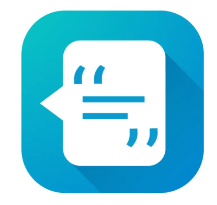
6 looks like a comment on a document
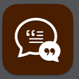
5 looks like a conversation
4 implies editing (the pencil)
3 is okay, but colors imply instagram
2 implies conversation
1 is red, I associate quotations with a “softer” frame of mind, greens and blues
I would take 4, and then 6.
Also because those I think that those colors are something, you do not find very often with apps on the iPhone.
There are a lot of blue and red apps on my one, that makes them hard to distinguish sometimes without a closer look.
To use an other color makes an app easier to identify.
Number 2 with the inner most part changed from lines to quotation marks and with the colors like that of 8
Number 9 was my first choice until I noticed that the thought bubble looked like a devious face ( or maybe, mischievous, or just not a happy-ish face). I can’t unsee this.
Number 4 reminds me of a conspiracy theory
Numbers 5 and 6 look dated or maybe it’s just the colors
I should also state that my favourite is 1, if the speech bubble could be smaller and more centred within the rounded rect.
Also, I would echo recommendations to not choose a blue app icon - 7 apps and 2 shortcuts out of 20 icons on my home screen have a light blue colour scheme for their icon
If the app name starts with a Q and the aesthetic is traditional, I like 4 the best.
If the app name does not start with a Q and the aesthetic is more modern, I like 10. It seems the cleverest (I read it as being able to chunk and sort quotes). A note on color, though. I would image firey gradients may be on their way out. 10 may look nice on a black background (and bump up the size since there’d be no shadow).
None of this icons has scalability (when presented in as small as 90px to 200px) or recognizability to the app branding. So far, I found 8 workable.
8 has an element to it that can tell a story and be recognizable over a long period of time. The shape of the chatbox looks like a person’s face (could be the author) where the quote originated from. The elements (the quotation mark and the lines) can be tightened and the designer can play with the sizes. They don’t need to have the same weight and can be positioned to look more like a face but still looks like a a quote and a line of sentence. There’s a good chance for the icon to be fun as well.
A good app icon should tell a good story and evoke a certain mood for user’s to find it delightful to look at in their homescreen.
My view is that the form should follow function, even for an app icon. Color and design will follow once you realize that the icon does need some level of functionality from the outset. For me, the most important things about an app icon would be (1) high contrast so I can easily see it on my phone, and (2) the icon give me a signal of what the app is all about. So on color, for me it doesn’t matter too much as long as it is easily visible. You don’t have to go black and white, but contrasting colors are helpful. For functionality, I agree with @beck in that if this is a quotation type of app, quotation marks or a Q might be good.
One last point. Before you deploy your app or decide on a final icon, you might want to do a search and see how similar your choice is to app icons already out there (with the help of an IP attorney). These icons are like logos or trademarks, and legal fights can ensue if you choose an icon that is too similar to one already in use.