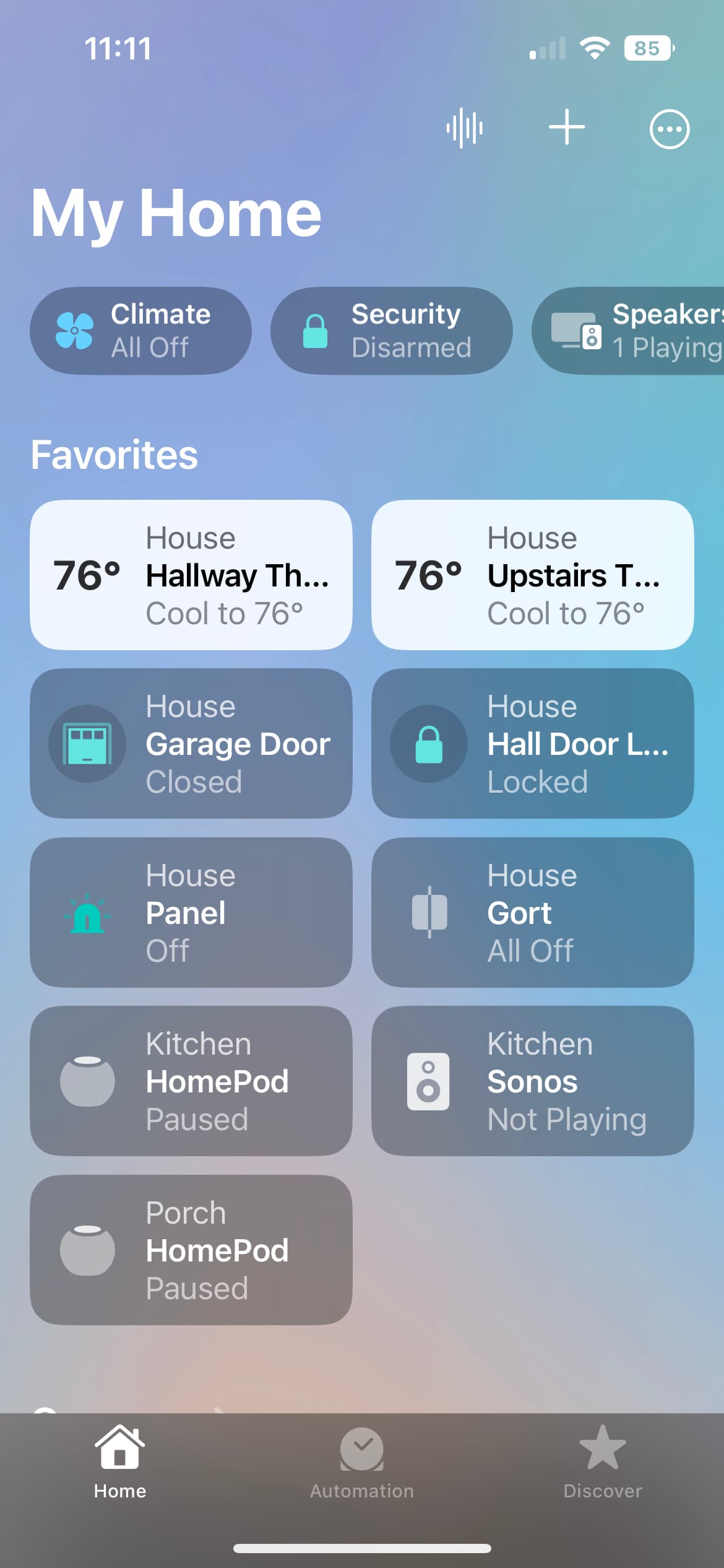
The nice compact grid has been replaced by a scrollie list. Oh, but you think the larger buttons make it easier to turn things off and on? Nay! You have to tap the icon (with your left thumb, I might add) to turn devices on and off. Anywhere else you tap on the other 80% of the button opens the properties for that device.
(Hoping I missed a setting for grid display, but I don’t think so.)
Do you have Accessibility with larger text? When I changed to larger text, my screen looked like yours, otherwise it’s not a list. Then again, your text doesn’t look large.
When I was looking into this, I noticed that you can set “Per-App Settings”. It’s at the bottom of the the Accessibility settings. So you could keep larger text for everything else and still have smaller text for Home. You may already know this but I didn’t until I stumbled on it last night.
Yes, thanks. I’ve been using that. But it doesn’t help to stretch my thumb to the other side.
Not a huge thing, I just preferred anywhere on the button to toggle, and hold for setting.