I’ve really enjoyed iOS widgets since they were introduced. I’m all about saving clicks and time, and to be able to see things like my calendar and the weather at a glance has come in really handy. I’m also running the iOS 16 beta with lock screen widgets; a cool addition to be sure, but I find myself not paying attention to them. I suppose that’ll just take some getting used to.
As I did some reorganizing on my phone screen this past weekend, I found myself getting frustrated trying to find a balance between just enough and too much information on the screen. Super, I now have my calendar, weather, and Streaks app showing me information, but now (best case scenario), I’ve just lost space for 12 apps with the information from just 3 apps. That’s okay, but I think a widget really needs to earn its place on the screen.
What I also find interesting is the relationship the widgets on my phone screen have with my other devices. What do I mean by that? Well, let’s say I have the Fitness (Activity Rings) widget on my phone screen. Do I really need it on my watch as well? Instead of having the activity rings widget show on my phone AND on my watch, I’d almost suggest just having it on the watch is good enough as it’s available at a quick glance all the time. So why put it as a Lock Screen widget? Why put it as a home screen widget? See how I’m getting myself all tied up in this?
Then there are the scenarios where I’ve seen people have a calendar widget on their home screen (say 2x4), but then they also have the calendar app icon in their dock. To me, this is a waste. If clicking the widget takes you into the app (e.g. Fantastical), then why have the Fantastical app icon on your home screen at all.
Finally, some apps widgets aren’t very useful. They will take up a big chunk of real estate on your screen and only show 1 or 2 of your 6 calendar events for the day. Some app devs use the allocated real estate better than others.
I guess I find the interplay between devices, widget sizes, and information density to be a bit overwhelming. Curious to see how other MPU’ers deal with this, or if I’m just overthinking this WAY too much.
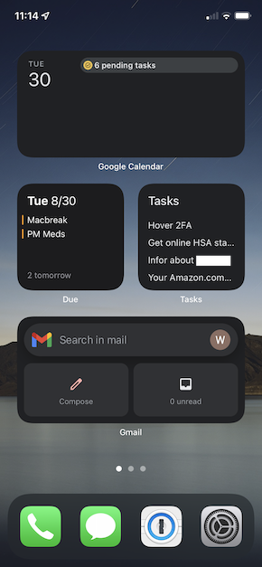
I have nothing but widgets on my iPhone home screen and with the exception of 4 folders my iPad Pro is also just widgets. Prior to widgets I kept my apps in folders but usually launched them with Siri or search.
Now that widgets are available I use them as a status board. Weather and battery widgets are one screen left of the home screen. Apple & Google Maps and Waze are one screen right.
I tried a lot of combinations before I settled on this simple layout.
I agree with you on this. If I have a widget for an app on my homescreen, I do not also have the app on my homescreen. I use the widget to access the app.
I found that I prefer to stack my widgets. Those less useful ones get layered under the more useful, but are still readily available with a quick swipe (or 2 or 3). That way I am not wasting screen real estate with with poorly designed widgets. Interestingly, at first I was not interested in stacks and thought it was a useless feature. However, after being frustrated with all the wasted screen real estate, I realized that stacks are a great solution.
Regarding duplicating widgets across devices, it all depends on which device I am using at the time. When I am using this device, will I ever want to see the info for this widget? If yes, then I include it, if no, then I don’t. And over time I may find that my assumption was wrong, in which case I make an adjustment (add or remove the widget).
And sometimes I find that on a certain device I can make use of a different size widget which is more/less information dense. In that case, while I might prefer to have access to the info from a different device, the specific size is enough to switch devices. I haven’t installed any betas, so I haven’t played with lock screen widgets, but this might be the type of widget that gets put on my lock screen when available. That is, the widgets on my lock screen would be ones which I would want to check on that device when I am not otherwise using that device. Whereas, widgets on the home screen would be ones I would want to check while using the device. Yes, that could mean that some widgets would end up in both locations, while others would only be in one or the other location. Again, as I observe my usage patterns over time I would adjust accordingly.
I decided this year to go minimalist on my phone and iPad, and only have two screens on both, mostly just widgets now. All apps have been moved to the library and I mostly just open stuff by pulling down and using search (I never thought I’d be one of these people, but it’s so much easier than scrolling to the app like a mere mortal ).
I was going to be brutal and delete some apps that are nice but that I rarely use, particularly after seeing posts on here, and I did delete a couple, but then I felt uncomfortable not having them to hand so I put them back. Since they’re in the library they’re not bothering anybody and I don’t see the point in stripping my iPhone and iPad down further.
I haven’t embraced this on the Mac, and it’s for a really annoying reason: I wish there was a way to make the notifications/widget bit stay on screen permanently. I have a wide screen monitor; I can afford the sacrificed real estate and it would be so useful just having that bar with my calendar view, task list, latest notifications etc always visible. I hate having to go find it and thus rarely use it. In fact I pretty much only use it when I’ve missed the alert for a new Slack message and bring up notifications to see if it’s something important or something to ignore for now, and probably 60% of the time I don’t even do that, it’s often easier to just look at my phone notification to see if I need to respond immediately. (My Slack often has a lot of unread messages so I find notifications easier for checking if I actually need to open Slack and do something or if it can wait.)
Sorry, second post I meant to add that the improvements to widgets is why I’m excited for iOS 16, I can’t wait to see what I can do with the Lock Screen!!
This is pretty much how I’m set up as well— no apps on the homescreen, just widgets. Three items in the dock on my phone; four + library in the dock on my iPads…
Yes, I have a radio alarm shortcut that runs every morning and I picked up my phone and was alarmed to see a giant picture of the song playing instead! Odd design choice there.