I’m a bit concerned if Apple still cares about the usability of macOS. There a numerous examples of low usability (sometimes even user-hostile) and low accessibility. Here are a few examples.
Low contrast and unclear input fields
You end up in this screen when you add a custom shortcut for an app. For the Menu Title (1) it’s unclear that this is an input field, and it’s inconsistent with the input field for Keyboard Shortcut (2). This has some contrast, but the contrast is too low for many people.
I like that Apple redesigned Settings and made it more consistent with other platforms. What I don’t like is that it’s hard to find settings.
If you want to adjust sleep settings, you need to enter sleep in the search box. Next, you go to Display energy settings. There you have to guess that you need to go to Advanced…
In Advanced, you can prevent your Mac from sleeping. It says Sleeping, but if you enter Sleeping in the search box, it doesn’t show Display energy settings in the search results. That’s stupid and the setting is too hard to find (at least for my standards).
You can’t tab through dialog boxes by default. To do this, you have to use the keyboard shortcut (fn) + control + F7. A shortcut that isn’t easy to find, and I couldn’t find it in Settings. As a result, many people will think this isn’t possible. This also makes macOS less accessible.
These examples aren’t rocket science and things that Windows does better.
I hope Apple alters course with the next release of macOS, but I’m not confident about it as long as Alan Dye is in charge.
The option to tab through dialog boxes is still there, although as you point out in your post, many of these things are not as easy to find since the redesign of the system settings.
In system settings navigate to the keyboard option (for me this is near the bottom of the list on the left hand side).
Then toggle on the option for keyboard navigation. This was already on for me as I upgraded to Ventura from my previous install, and keyboard navigation is something I always switch on when I setup a new Mac for the first time.
Just adding this incase others are still getting used to where certain settings are now located since the redesign of system preferences to system settings.
System Settings was written using SwiftUI. It is definitely not on the same level as AppKit, but hopefully this will force Apple to bring it up to that level.
You could change the contrast (and many other settings) with switching on the relevant control within the Accessibility features.
I do not know, why you have a shortcut like this on your system, but the Systemstandard still is simply the Tab-Button (or Shift-Tab for reverse direction) for this.
Do you have any Apps on your system, that alter shortcuts?
They are at the same places, as before. I couldn’t find anything that was easier to find within the previous version.
Due to the fact, that you now see the content of the various areas, it is even easier to find the settings you are looking for.
macOS is very complex software, parceled out and produced by a large number of developers, with a multi-layered bureaucracy on top. I think we tend to look at an OS monolithically and expect uniformity, a factor that Apple marketing has spent decades trying to convince us is true. But it cannot be true. Big corporations cannot produce things that way.
Yeah, Settings in Ventura is a bit of a cluster, but thankfully I don’t need to go there often since Ventura inherited its settings from Monterey etc.
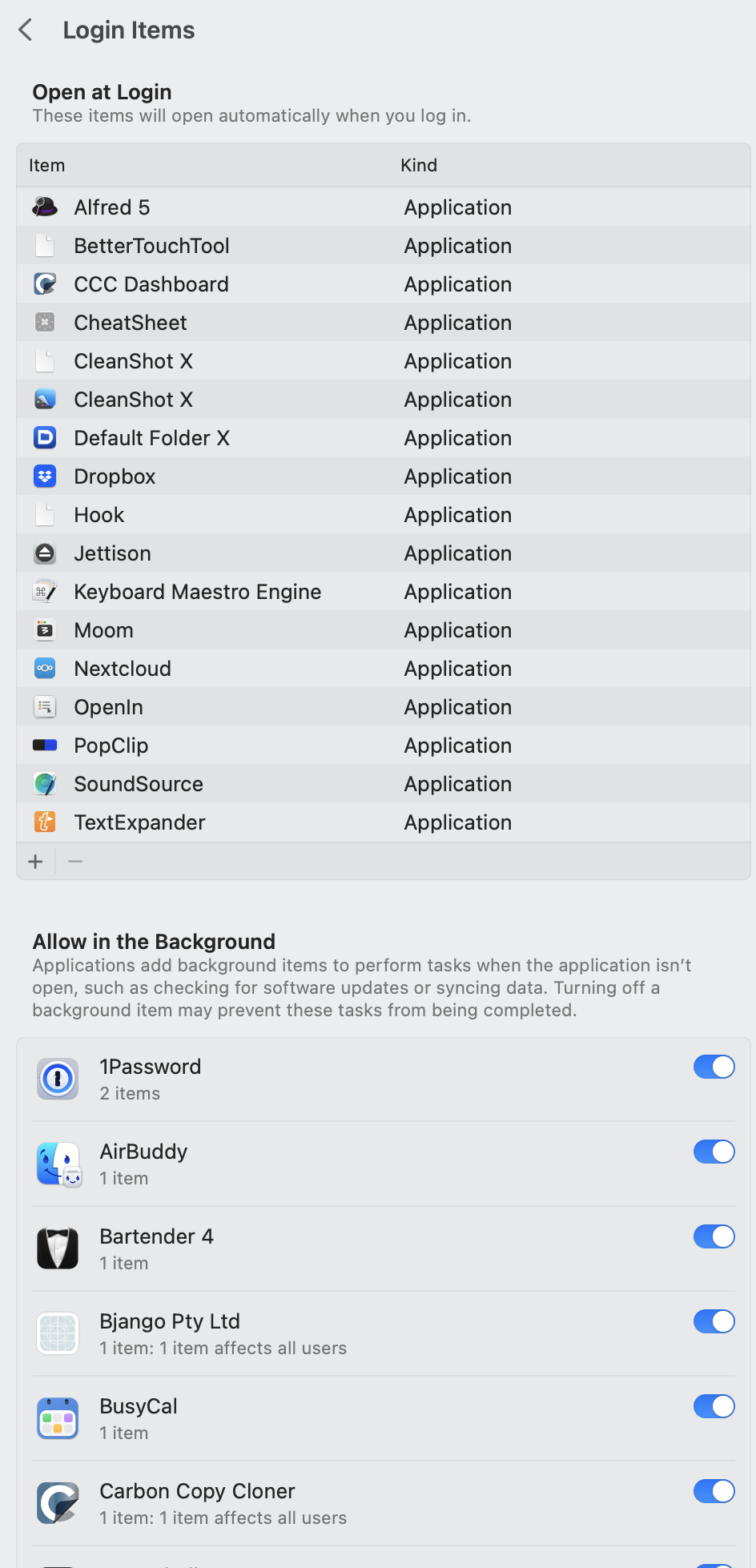
There are several items which have been moved to different locations in Ventura when compared to previous versions of macOS. For example, here is a screen shot of system preferences in Monterey.
Many of the items that were visible at this level (e.g. Time Machine, Sharing, Startup Disk, Software Update, Date and Time, etc.) are now to be found under the general tab.
Extensions was also visible when opening system preferences, however, it is now found at the bottom of the Privacy and Security section when it used to be next to the old Security and Privacy icon.
Items that started at login used to be found in the Users and Groups section, where you could alter your account settings for the local machine. In Ventura this section now contains far less than before.
All of the options that were available before are still available now. However, a number have moved to different locations within the System Settings application.
The previous system of organising the old System Preferences did not always make the most sense as items were added over time as new features became available. New items were often added in places that were not always obvious, however, overtime people did adapt and get used to where to find certain items.
In time we will all adapt to the new System Settings and become more accustomed to where different features/settings can be found. Like any change it will take time for people to adapt to a new way of working. I feel we are very much in a transition phase where many years of doing things in a certain way will need to be learnt again as we adapt to the changes in System Settings.
Adapt? Apple was about good design, it just works, and ease of use. I design software for a living and don’t see myself as a master, but this design is mediocre at best. Finding common setting shouldn’t be this hard.
I totally agree that Ventura is a bit of a mess out of the gate, accessibility-wise. I was surprised to see a lot of poor low-contrast design reappear in Ventura (admittedly, a lot of it is in the new Settings app), when they’d already experienced this problem and fixed a lot of it on iOS.
They still seem to favor buttons that don’t look like buttons, which is endlessly confusing for the less-computer-savvy and makes it just a little bit harder for experienced users. It’s not good design language.
However, I think you’re not right about this:
Navigating through dialog boxes using the tab key is not “Keyboard navigation” as defined in Settings. Turning on Keyboard navigation means that you can. use the Tab key for ALL of the controls on the screen. With it off, Tab is limited to “text boxes and lists”, which seems to include dialog boxes. That is, I have “Keyboard navigation” toggled off and I regularly tab through dialog boxes.
I think it is the right decision to have it turned off by default, otherwise an errant tab for a mouse user could cause a lot of confusion.
I’m not sure why you had to use fn+ctrl+F7. Perhaps you have a conflict somewhere?
Of course, this keyboard navigation stuff isn’t all roses — there’s an entirely different level of navigation available in Accessibility > Keyboard called “Full Keyboard Access”. Just to confuse things, this feature is more prominent because Keyboard isn’t visible when you first open Settings. Many of my clients have assumed it’s simply gone! Grr.
It’s not only on macOS. I recently got a new 12.9 iPad Pro to substitute my broken-screen iPP from 2017. I set up to run a migratin between the two devices --which I had already done in 2017 when I migrated from an iPad Air 2 to the then new 10.2’’ incher-- but, somehow, the process did not work as expected. It seems that the new iPad identified that a new iPadOS version was available and insisted on updating the OS while doing the “migration” between iPads. Somehow it seems like nobody on Apple thought that could be the case? The new iPad was intending to update itself to a newer iPadOS than was on the older iPad!
My impression is that Apple, with all its legendary “it’s all about user experience” focus, is spread thin on many fronts and they are tending to do what they can get away with.
My frustration is mainly because I love my Mac, but the experience with macOS itself has gotten worse in recent years. And yes, I notice the quality issues on iPadOS too.
Because shen the new iPAd was installing the update, the “Migration Assistant”-like process in the older iPad stopped because it lost Bluetooth/Airplay/whatever connection to the new iPad.
I don’t say that was the right or wrong thing to do --perhaps it would be more useful to first migrate and then let iPadOS update itself regularly-- but of course there was no information of this, or how to trigger the “Migration Assistant” manually after the iPadOS was updated. I only saw that option after a factory reset of the new device.
Well to the best of my knowledge that was what I was trying to do. But between steps 5 and 6 the new iPad insisted on downloading a new iPadOS release, the download process took several minutes so the connection between the two iPads stopped after a while. Also I was not made aware of any mechanism to run Quickstart manually (although it seems to exist)
I’ve had similar things happen. I think Apple may have addressed this, but my standard way of dealing with it now is to set the new device up as a new device, update the OS, wipe the device, and set it up with the migration procedure. It’s a pain, but it works.