Great, looks like Microsoft has finally learned that we can use color in UI in the 21st century and that rounded corners are easier on the eye.
I still roll eyes when I remember what a piece of garbage their Metro design manifesto document was. Windows has been utterly depressing to look at for years now. It was so refreshing to land on macOS then.
1 Like
No, it did not. I have had a few Surface devices from that era and they were infuriating to use.
What was most idiotic about the Metro design language was the motto “content, not chrome”. Yes, content is king and it should shine, that is part of the point of flat design, but that does not mean eschewing color and meaning in all interfaces have to be that depressing monochromatic landscape where nothing means anything.
Most Metro apps from that time were almost a fascinating exercise in ugliness, where Apple had the post-iOS 7 redesign and Google had the first iterations of Material Design. I had used Windows faithfully for over 20 years at that time and I hated every second of Win 8 and even 10.
3 Likes
I assume you also hated Windows Phone?
It’s always good to know what the competition is up to.
2 Likes
Did not have one. Was on Android at that time and fairly happy.
To be more precise, I mean the predominance of walls of text and the complete lack of meaningful contrast and symbols. People lament iOS’s discoverability of features and affordances, but Metro was a masterclass on the matter.
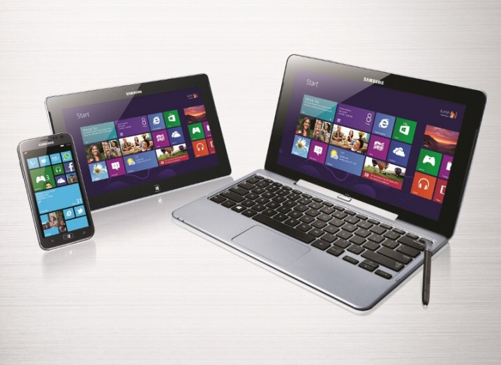
Look at this:

- No icon or symbol immediately visible in the weather app (apart from an obscured background);
- Tiles are monochromatic; only silhouettes, which need deciphering and/or reading. No glanceable content, unless you learn by heart diverse shades of blue.
Same for the charms bar:

… which was actually a good idea in terms of features; I wish macOS would have a more universal share sheet, like Win 8 attempted. But what are those things? Why the hell do they have to be esoteric shapes of black and white? Why do I have to read every time to remember what button does what?
Maybe I’m wired wrong, but not only my eyes could not parse this, it directly made me run for the closest window (heh) so as to jump from it. It felt like the most drab of business open spaces had colonized my computer:

Kill me already.
Now that’s pleasant to look at (and there’s real color and contrast):
1 Like
Yup, that’s why I was especially bashing Metro itself (I did read the design documents of the time and I found them to be among the most moronic pieces of tech writing ever made). Win 10 did walk back that line a little, but far from enough to my taste. I really regret the look of Win 7. I love translucency and frosted glass effects, I’m one of those monsters who like to see the wallpaper peer out from under Big Sur’s translucent windows. 
1 Like
Yep, I’m on a project to upgrade 18k PCs to Win10 now and even getting resistance to that from some quarters …
What I will credit MS with though, is the updates to some of their apps is quite amazing, meaning quite often with many new features (maybe they were starting from a long way back …  )
)
Each to their own. 
1 Like
Windows 11 has officially been leaked.
Windows 10 was supposed to be the last one, swear.
Oh well, if one thing is consistent, it’s that you should never hold Microsoft at their word about anything.
5 Likes
One Microsoft employee, Jerry Nixon, made that statement and when asked Microsoft said “ We aren’t speaking to future branding at this time, . . .”
But when the choice is clicks or accuracy the media seems to usually favor the former. I’ve always wondered why MS didn’t say something after the Win10 forever myth got so big.
3 Likes
I thought this was pretty good. ![]()

5 Likes
Here is a recap of everything that was announced at the event.
1 Like
They can/should learn from Apple about streaming…
What a terrible experience…
I’m used to terrible. I was going to watch the event but my Comcast internet went down (again) 3 minutes before it started. And it took 40 minutes before their app acknowledged the outage. ![]()
Yeah, I think I’m just about ready to abandon Xfinity Comcast in favor of Verizon Fios. It was impossible to watch the stream on Microsoft’s website.
For those who watched the stream, what were your favorite changes?
I’d do that in a heartbeat but my only other option is only 25 Mbps down.
When I started carrying an external keyboard to use with my very expensive MacBook Pro, I knew it was time to look at Windows.
During my three years as a Windows-only user, I loved the hardware options. The Microsoft Surface Book is truly a remarkable piece of tech.
If I need lightweight, there are multiple cheap options. If I need a workhorse, there are many options, just more money.
Windows 10 is a mature operating system. Never had any of the old problems with crashing and the blue screen of death. It is very stable.
What is missing is the app community. The independent developer community for Windows is no where close to the quality and depth of the Mac developer community. Many independent Windows apps are either electron apps, look like electron apps, or they are still using the Windows 95 look and theme.
In the end, it was the independent app developer community that brought me back to Apple. Plus, Apple discovered that laptop keyboards that work are “magic.”
Now, if only some Mac engineer discovered that power users like a lot of ports on their laptop and are willing to deal with a heavier laptop in order to have built in ports.
11 Likes